


Type Parents
After brainstorming, I chose these two fonts from my list of parent fonts. I wanted to design with a theme in mind so I went with something outlandish: A Haunted Carnival. These were the two types that best-evoked carnival and haunted, respectively.

40 Thumbnails
From the 40 thumbnails that I drew, I selected two that I found most effective. Using 16 and 18 from previous thumbnails, I initialized 40 additional sketches, playing with contrast, silhouettes, and different patterns.


40 Sketches
I wanted to keep the serifs and hatch pattern of Brim Narrow, but also incorporate the unique slime embellishments of Shlop, as well as its roundness.
From here, I narrowed down 10 designs I wanted to clean up and elaborate on for critique.

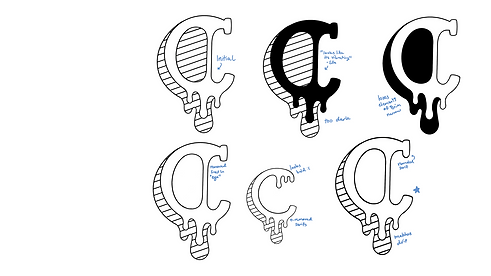
Critique 1
After carefully deciding on which elements to incorporate, I decided on number 10 and worked to flesh it out fully.
Some critiques I got were to remove the ball-like serif seen in numbers 1 and 9. Someone else also suggested making the bar element seen in 2 and 8 into a stretched and tapering line to match the drips at the bottom.

Digital Execution
An element I added to further my type’s unique identity was turning the thickness of Brim Narrow into a bar to mimic that of a carousel horse.
I removed the bump at the top per a suggestion during the critique. I also added an additional drip to the lowercase ‘c’ for cohesiveness’ sake.
Critique 2
Taking suggestions from my peers, I mainly tried different versions with differences in contrast and the look and placement of the serifs.
A big concern was readability and scalability, but after removing the lines within the eye and looking at how it scaled on Illustrator, we assuaged those concerns.
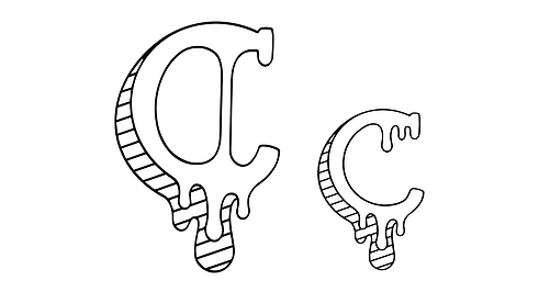
Final Design
Creeping Carousel
This display font combines the antique and tactile nature of Brim Narrow Combined with Shlop’s oozing horror, creating this theatrical goopy typeface. It’s perfect to advertise the big top that’s rolling this spooky season!
